TipBubble Tutorial
TipBubble is one of the controls that comes with the Free Bubbles library (it is called this way because its most obvious use is for making tooltips).
Below is a quick overview of TipBubble properties.
TipSide
TipSide property controls on which side of the bubble to show the tip. It can be set to Bottom, Top, Left or Right.

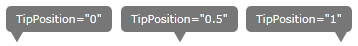
TipPosition
TipPosition property controls positioning of the tip on the side of a bubble. It accepts values in the 0 to 1 range, with 0 corresponding to top or left, 0.5 center, and 1 right or bottom.
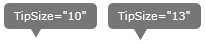
TipSize
TipSize property allows you to change the size of the tip. Since the tip is made from an equilateral triangle, TipSize is the size of all of its sides.
TipFill
TipFill property defines the Brush used to fill the tip. Typically, TipFill should use the same Brush as Background property.
TipStrokeThickness
TipStrokeThickness defines the width of the stroke around the tip. In most cases, it should be the same as the corresponding side of the BorderThickness property.
Background, BorderBrush, BorderThickness, Padding…
All common control properties behave in the same way as you would expect for all other controls.
Examples
Basic TipBubble
    <tip:TipBubble Background="#FF7FBC65"
                   TipFill="#FF7FBC65"
                   TipSide="Left"
                   TipPosition="0.5"
                   TipSize="10"
                   Padding="10 5"
                   BorderThickness="3"
                   BorderBrush="#FF89EE78"
                   TipStrokeThickness="2" >
        <TextBlock Foreground="White">
            Background="#7FBC65"
            <LineBreak/>
            BorderBrush="#89EE78"
        </TextBlock>
    </tip:TipBubble>
TipBubbble With Complex Content
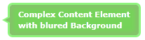
    <tip:TipBubble Background="#FF7FBC65"
                 TipSide="Left"
                 TipPosition="0.5"
                 TipSize="10"
                 TipFill="#FF7FBC65"
                 BorderThickness="3"
                 BorderBrush="#FF89EE78"
                 TipStrokeThickness="2" >
        <Grid>
            <Rectangle Margin="5"
                       Fill="#FF6FCD52"
                       RadiusX="2"
                       RadiusY="2">
                <Rectangle.Effect>
                    <BlurEffect Radius="9" />
                </Rectangle.Effect>
            </Rectangle>
            <TextBlock Foreground="White"
                       Margin="12 6"
                       FontWeight="Bold">
                Complex Content Element
                <LineBreak/>
                with blured Background
            </TextBlock>
        </Grid>
    </tip:TipBubble>
ToolTip stlyed using TipBubble
ToolTip style (sans animations)
    <Style TargetType="ToolTip" x:Key="tipBubbleStyle">
        <Setter Property="Padding" Value="8"/>
        <Setter Property="BorderThickness" Value="1"/>
        <Setter Property="Template">
        <Setter.Value>
            <ControlTemplate TargetType="ToolTip">
                <bubbles:TipBubble
                    BorderThickness="0"
                    Padding="10"
                    TipSide="Bottom"
                    TipPosition="0.2"
                    TipFill="LimeGreen"
                    TipStrokeThickness="0"
                    CornerRadius="5"
                    Content="{TemplateBinding Content}">
                    <bubbles:TipBubble.Background>
                    <LinearGradientBrush StartPoint="0.5,0" EndPoint="0.5,1">
                        <GradientStop Color="Yellow" Offset="0.0" />
                        <GradientStop Color="Red" Offset="0.25" />
                        <GradientStop Color="Blue" Offset="0.75" />
                        <GradientStop Color="LimeGreen" Offset="1.0" />
                    </LinearGradientBrush>
                    </bubbles:TipBubble.Background>
                </bubbles:TipBubble>
            </ControlTemplate>
        </Setter.Value>
        </Setter>
    </Style>
Styled ToolTip
    <Grid Width="250" Height=”100” Background="#eee">
        <ToolTipService.ToolTip >
        <ToolTip Placement="Top" Style="{StaticResource tipBubbleStyle}">
            <TextBlock Foreground="#fff" Background="#7000">
                <Run FontWeight=”Bold”>TipBubble</Run> is fun…
            </TextBlock>
        </ToolTip>
        </ToolTipService.ToolTip>
    </Grid>
